B2B Articles - April 18, 2022
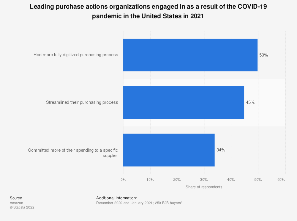
A least 50% of B2B buyers moved to a more fully digitized purchasing process in 2021 as a result of the pandemic.1
A website is a critical element of successful digital marketing and sales processes. In this blog post, we’ll discuss some statistics that show just how vital functional and engaging website design is and provide some tips for improving website design and usability.

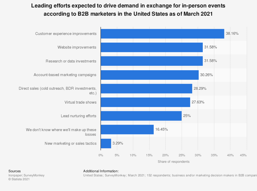
B2B buyers have found that a digital purchasing process suits them, and 70-80% of buyers now prefer remote interactions or digital self-service.2 Thirty-one percent of B2B marketers said website improvements were one of the leading efforts they expected to drive demand in place of in-person events in 2021, second only to customer experience improvements.3 Landing pages and content get a lot of attention — as they should — but if your website is difficult to navigate, leads will struggle to find relevant content and reasons to convert.
- Ironpaper

- Deloitte
Well-planned and executed user experience (UX) is critical to meeting the growing tide of digitally-savvy B2B buyers. A bad experience on your website will negate the benefits users get from your content. Forty-two percent of visitors will leave a website because of poor functionality 4, and 88.5% of designers believe that slow loading time is the biggest reason viewers leave websites.5
Website loading time makes up a huge part of the user experience. A study conducted by Deloitte and 55 found that an improvement of as little as 0.1 seconds in loading time increased website engagement by up to 8%.6
-Deloitte
Making minor improvements to the back end of your site like utilizing compression, limiting redirects, optimizing images, and leveraging browser caching can improve your load time and give your visitors the experience they expect.
Working with a performance-optimized hosting solution can also improve website loading speed and create a better user experience. A content delivery network (CDN) can improve website loading time even more and improve UX and engagement. CDNs distribute your website to strategically-placed data centers and load your website from a server closest to each website visitor, reducing distance data requests and helping your website load faster.
Website navigation is another crucial piece of your users’ experience with your site. Make it easy for users to find what they’re looking for with hyperlink differentiation, descriptive navigation menus, and global navigation headers.
UX and visual design go hand in hand — they inform and complement each other to create a cohesive, delightful experience for website visitors. Viewers make snap judgments about your website based on its design, layout, and even the colors used.
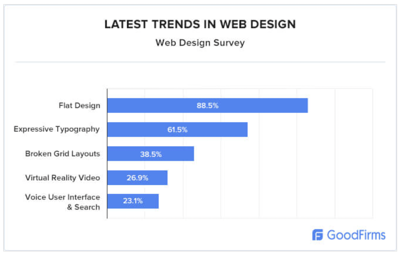
In a recent survey of 200+ web design companies, 88.5% of web designers surveyed said flat design is the biggest design trend they’re seeing today.5 Flat website design is characterized by bold, contrasting color schemes, simple layouts, and minimalist navigation and interfaces. Flat design’s popularity makes sense given that it creates an easy-to-use, visually engaging site for users and makes it easy for businesses to speed up their loading time and emphasize what’s important.

This same survey found that 84.6% of survey respondents named crowded design the most common website design mistake they see.5 Crowded websites are hard to navigate and unattractive to users. Thirty-eight percent of users look at your website’s navigational links and page layout when visiting for the first time (Top Design Firms, Website Redesign Checklist: 5 Trends to Consider, April 20, 2021) –- so encourage them to interact with your website through simple layout and intuitive navigation.
-GoodFirms
Finally, when it comes to the all-important color scheme, consumers prefer primary (26%).7
Mobile browsing is not just a B2C concern any longer. Boston Consulting Group and Think with Google Estimated that 70% of B2B search inquiries would be made on mobile devices in 2020.8 Not optimizing your website for mobile use will leave many of your leads unimpressed or frustrated with their experience.
According to one Google UX study9, users said they liked mobile sites that:
The most important thing to remember when updating your website for 2022 is that your customers want a unified, personalized digital experience. Your website’s UX design, visual design, and mobile browsing should contribute to that buyer’s journey.
Digital leaders in B2B drive five times more revenue growth than their peers. These digital leaders create consistent online experiences, use data to their advantage, and anchor their cultures in innovation and execution. Optimizing your website for B2B browsers and buyers is crucial for becoming a digital leader and driving growth in your organization.
-McKinsey
- McKinsey
Sources
1Amazon, B2B E-Commerce in Evolution Report, May 2021
2McKinsey, These eight charts show how COVID-19 has changed B2B sales forever, October 2020
3Ironpaper, The Digital Buyer's Journey is a B2B Challenge - and Opportunity, July 2021
4Top Design Firms, Website Redesign Checklist: 5 Trends to Consider, April 20, 2021
5GoodFirms, Website Design Stats And Trends For Small Businesses - GoodFirms Research
6Deloitte, Milliseconds make Millions: A study on how improvements in mobile site speed positively affect a brand’s bottom line, 2020
7Top Design Firms, How Your Website Can Use Colors That Increase Sales, July 21, 2021
8Boston Consulting Group and Think with Google, Mobile Marketing and the New B2B Buyer,” The Boston Consulting Group in partnership with Google, October 2017
9Google and AnswerLab, What Makes a Good Mobile Site?, February 12, 2019
10McKinsey, How B2B digital leaders drive five times more revenue growth than their peers, October 10, 2016
HubSpot, 10 Tips That Can Drastically Improve Your Website's User Experience, December 4, 2020
Kinsta, How to Improve Website Navigation (With Examples and Reasons on Why You Should Do It), January 18, 2021
HubSpot, 9 Quick Ways to Improve Page Loading Speed, May 25, 2021
Tel 212-993-7809
Ironpaper ®
10 East 33rd Street
6th Floor
New York, NY 10016
Map
First-party data marketing
SEO for B2B
Customer journey strategy
ABM Agency
Marketing for IoT Companies
HubSpot Implementation
B2B Product Marketing
Measurable Marketing
IoT go-to-market strategy
IT Marketing
HubSpot for ABM
Go to market strategy
Technology Marketing
Marketing for IT Companies
ABM Campaigns
B2B lead generation
B2B Marketing and Growth Agency.
Grow your B2B business boldly. Ironpaper is a B2B marketing agency. We build growth engines for marketing and sales success. We power demand generation campaigns, ABM programs, create B2B content, strengthen sales enablement, generate qualified leads, and improve B2B marketing efforts.