B2B Articles - January 20, 2014
Making it easy for a website visitor is essential for building a relationship. The combination of easy navigation with relevant content will help significantly reduce the number of visitors who bounce (or leave your site). Your web design navigational scheme needs to make sense to your visitors--not just your internal teams.
Finding balance
Easy and clear navigation does not mean listing everything. Nor does it mean having too few items, which cause users to scan through long, exhaustive content pages. Provide a great user-experience by finding a balance between the two. Navigation must be in service of your website's content. Visitor's should be able to quickly scan the navigation and make a decision on where to find content they are looking for.
Sub-navigation
Using sub-navigation can help break down your navigation choices into top-level groups. Once a visitor makes an initial selection, your website can use drop down menus, scrolling panels, sidebar navigation, pop-over selection boxes or a number of UX tools to help guide a visitor to the right content. Don't make the sub-navigation too complicated or you run risk of confounding a user. Sub-navigation ultimately allows for a website to break down navigation into a series of simple, bite-sized decisions.
Call-to-actions
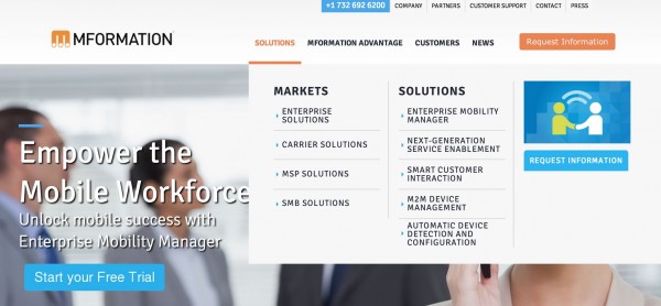
Certainly calls-to-action should occupy the header space, but just like navigation, reduce the number of calls-to-action to create emphasis and clarity. In the example below we show an enterprise website that has an expanded drop down menu. This drop down contains two element types: standard, second tier navigation plus a visual call-to-action. In this website, each call-to-action has embedded event tracking, so we can determine which events are eliciting the right response based on placement and messaging. Overloading a website with too many such calls-to-action can not only overwhelm a guest, but can make tracking pointless.
Navigation affects SEO
Search engine optimization relies on semantics and keyword associations with a domain. A website's navigation is an important element in optimizing a website for search ranking. Be descriptive in your navigation, as well as your sub-navigation.


Expanded "rich" content drop down menu

Tel 212-993-7809
Ironpaper ®
10 East 33rd Street
6th Floor
New York, NY 10016
Map
First-party data marketing
SEO for B2B
Customer journey strategy
ABM Agency
Marketing for IoT Companies
HubSpot Implementation
B2B Product Marketing
Measurable Marketing
IoT go-to-market strategy
IT Marketing
HubSpot for ABM
Go to market strategy
Technology Marketing
Marketing for IT Companies
ABM Campaigns
B2B lead generation
B2B Marketing and Growth Agency.
Grow your B2B business boldly. Ironpaper is a B2B marketing agency. We build growth engines for marketing and sales success. We power demand generation campaigns, ABM programs, create B2B content, strengthen sales enablement, generate qualified leads, and improve B2B marketing efforts.