
B2B Articles - May 08, 2017
A website redesign shouldn't just improve look and feel of your B2B company. Instead, a redesign must grow your lead database and increase conversions.
According to Kinesis Inc., once your page loads, users form an opinion in .05 seconds, so the pressure is on to make a good first impression and convert visitors quickly.
However, B2B companies too often jump headfirst into a visually stunning design. They want something edgy or modern, but they leave results to chance.
So first, follow website best practices for lead generation and conversion — which are the main goals of your site after all.
Here is a 7-step checklist to see results your website redesign process:
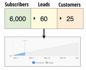
Perform a website audit using tools like Google Analytics to measure performance for your website overall. Conversion rate is king for site performance, above all other metrics. Make sure you know which user segments are visiting your pages, and if visitors convert into qualified leads. Ideally, you should know the overall percentage of Visitors > Leads.

Since lead generation and conversion are the main goals of your website, set expectations upfront. If your rate won't keep your business profitable, set your ideal conversion rate: % Visitors > Qualified leads. This gives your team a common goal. Then, everyone will be on the same page if you've hit or missed the mark with your website redesign. Be realistic yet ambitious.
A survey conducted by KoMarketing found that once on a company’s homepage, 86% of visitors want to see information about that company’s products/services, and 47% of visitors check out the products/services page before looking at any other sections of the site.
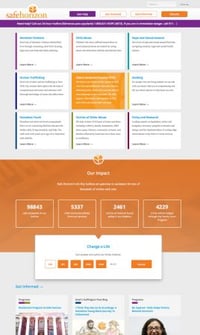 In a legacy redesign, you redesign your entire website in a big production process. And you give every page equal weight.
But for a lean B2B redesign, you start simply. So if a major piece of web real estate (like your homepage or services page) isn't converting leads, prioritize that page.
It’s vitally important that the most important traffic generators of your site are conversion machines. Or, at least, top pages should link visitors to a landing page which then converts them. (For help with growth-driven design, talk to a web design agency.)
Before you get started with fonts or colors, think about how to create the best user experience. Specifically, organize your content to set up your information architecture. Put your personas — not your assumptions — first.
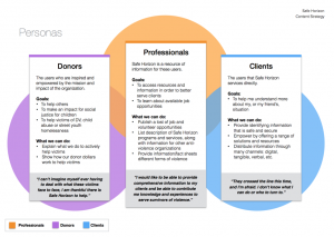 Start with an analysis of your main personas: The questions they ask, the answers and info they need. This will form the basis for your info architecture.
Next, get data on your prioritized pages. You want to understand why they aren't converting. For example, you can view "heat maps" in Hotjar or a similar software. Heat maps show you where people click on a page, or how far they scroll before leaving.
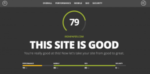
Also, you can run user tests and surveys to make sure your UX is strong, and visitors can find what they need. Finally, run a report of your website in HubSpot's website grader: websitegrader.com. This could show you some unidentified problems with site speed, mobile design, etc.
As for your navigation, remember this is the backbone of your website. Consider both SEO and link juice flow: Put the most important SEO pages in your main navigation. Then "branch off" into related pages, which all link back to the main "trunk" of the tree and send SEO authority back up top.
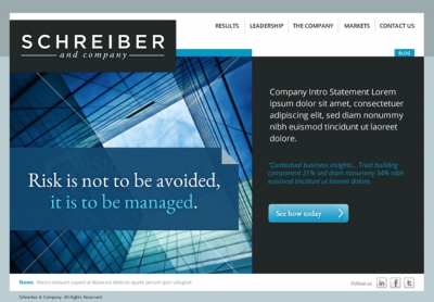 What does this company do, exactly? Don't be a generic site with bland navigation. Use keywords like "Law Services" or "IT Company," then use sub-menus to branch into more specifics.
Additionally, avoid giving pages generic names such as "Home." Do be specific and use SEO titles to your benefit, including keywords worked naturally into page names.
It’s not necessary to redo every page at once with new copy, design and navigation. Instead of a complete redesign, you should make small data-driven changes, which we call conversion optimizations. Overall, avoid the need to make every inch of your site perfect — this will come with time.
This is the growth-driven methodology: Prioritize a few pages, then test and refine based on the data you gather. This minimizes risk, using data to inform your design decisions. And you will quickly learn what works, then fix what doesn’t. Remember that all changes should improve conversion.
If you need a primer on growth-driven design or conversion optimization, check out HubSpot's free Inbound Marketing certification, or visit growthdrivendesign.com.
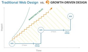
Once the pages you’ve redesigned have gone live, the fun doesn’t stop there. Now’s the time to drive traffic to those pages, while closely monitoring their impact.
Think of your website as a gateway to your sales funnel, and measure these metrics accordingly:
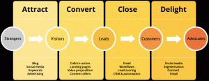
A successful redesign is not a one-and-done. Also, it's not a once-every-two-years approach. Instead, you should continually look at whether the newly implemented changes are having the desired impact.
Ask: Do the pages you redesigned have higher conversion rates than they did when you started? If so, you’re on the right track. If not, it’s time to iterate. You can run A/B tests, do some competitive analysis, and try incorporating new content offers.
B2B websites, first and foremost, need to convert visitors into leads. Therefore, it’s important to take that into consideration when redesigning your B2B website.
Opt for Growth Driven Design’s ongoing process of making data-driven, intentional changes over time, providing an opportunity to continually build momentum, ultimately, driving growth. If you need a marketing partner for GDD, consider partnering with a B2B marketing agency specializing in growth-driven strategies.
With this B2B website redesign approach, you will generate more leads and measure the ROI of your website like never before.
Sources:
https://www.tytonmedia.com/blog/51-insane-web-design-statistics-2016/
Tel 212-993-7809
Ironpaper ®
10 East 33rd Street
6th Floor
New York, NY 10016
Map
First-party data marketing
SEO for B2B
Customer journey strategy
ABM Agency
Marketing for IoT Companies
HubSpot Implementation
B2B Product Marketing
Measurable Marketing
IoT go-to-market strategy
IT Marketing
HubSpot for ABM
Go to market strategy
Technology Marketing
Marketing for IT Companies
ABM Campaigns
B2B lead generation
B2B Marketing and Growth Agency.
Grow your B2B business boldly. Ironpaper is a B2B marketing agency. We build growth engines for marketing and sales success. We power demand generation campaigns, ABM programs, create B2B content, strengthen sales enablement, generate qualified leads, and improve B2B marketing efforts.