B2B Articles - September 26, 2018
While it’s always nice to get a “facelift” on your website and a fresh new look, redesigning a website is about so much more than branding and visual appeal. Your website should be a tool for lead generation and sales -- something to drive new leads in the door. So engaging your target audience is crucial, and you should think continually about upgrading your website design for more engagement.

Design thinking should pay heed to things like usability, functionality, and performance. And when you redesign a website, or even just make small improvements to it, you need to think about more than just your fonts and imagery.
Thankfully, with a few simple upgrades, it's not hard to begin generating leads with your website design.
Oftentimes the first impression people have of your website is the messaging "above the fold," aka the modules on your homepage that they see before they need to scroll. This real estate is critical for capturing your audience's attention.

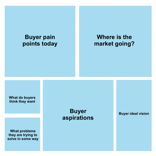
Your messaging here will largely determine if potential leads stay or go. So one of the most important things you can do in your website design is place a strong value proposition on the top of your homepage. This statement needs to be immediately relevant to your target audience, and it should relate to their pain points and aspirations. Otherwise, they will go back to the drawing board and seek out your competitors.
By updating homepage messaging and value propositions and following some of other tips laid out in this article, Ironpaper more than doubled the conversion rate for a client’s website in one month.
In order to write impactful messaging, avoid language that is self-serving -- for example, "We have 30 years of experience and great customer service." Your website visitors can find this language anywhere and will have no differentiated reason to stick around and learn more. They want to hear what is relevant to them, and how you can help.
So research the pain points of your leads and redesign your value proposition on the home page to be immediately relevant and valuable to them. You will then see your visitors stay longer on your website, engage with more site pages, and convert into leads at a higher rate.
Adding action language on your website helps drive more people to do what you want, such as:
You need concise calls to action in order to drive these results.
Calls to action should include an action verb like "visit," "learn," or "download" and be specific about the desired action you want them to take. For example, "Learn about 5 key features" is better than the generic "Learn more."
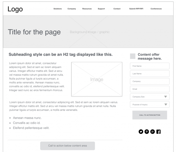
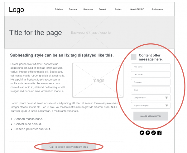
To improve your website engagement, you should put calls to action (CTAs) on key parts of your site with high visibility. For example, put CTA buttons on your homepage in the top half of the page design. Add CTAs to your navigation menu instead of a bland “Contact Us,” and also include them somewhere obvious on all of your internal website pages.
If it's possible with a CMS like Hubspot, make your CTAs trackable so that you can measure the clicks they receive. With data, you can also test which placements and variations get you the most engagement, gaining insights on your leads and what makes them tick.
Lead capture is the best outcome for a visitor exploring your website. Lead capture refers to the moment when you collect information in your CRM from a potential lead who gives that information willingly.

Information will help you identify and prospect a lead, such as: Name, contact information i.e. phone or email address, and personal qualifying information like company name or job title.
In order to capture lead information, you need forms or a chat box on your website. Add forms liberally on your website, on your features pages, and certainly on your "contact us" page or pages. Forms should include standardized questions, and they must link to your CRM so you can enrich your data there.
Once a new contact is converted, review the nature or the conversion and decide if the lead should go to your sales team or be nurtured further by marketing.
Simply adding forms or chat boxes visibly on your most important pages will increase engagement substantially for your website -- get more tips on improving your blog conversion rate here.
Links are how visitors navigate through your website. And if your website content is helpful and compelling, it will encourage visitors to engage with your company. So it makes sense that you want your pages to be easy to navigate.
Interlinking between your pages is critical to help leads engage, but also for search engine optimization (SEO). When a search engine like Google sees links pointing throughout your website, it learns what your content is all about and how different concepts are related. And this in turn helps you earn "authority" for key terms, which help new leads find you in searches.
So make sure to include links liberally on your website. Here are a few critical places:
Your website design matters for lead generation, so it should be functional, not just beautiful. So consider adding performance elements like forms and calls to action, and make sure your messaging is simplified and compelling in the most visible areas.
To drive engagement to other pages and increase your chances of converting new leads online, make sure to interlink between pages of your website.
Tel 212-993-7809
Ironpaper ®
10 East 33rd Street
6th Floor
New York, NY 10016
Map
First-party data marketing
SEO for B2B
Customer journey strategy
ABM Agency
Marketing for IoT Companies
HubSpot Implementation
B2B Product Marketing
Measurable Marketing
IoT go-to-market strategy
IT Marketing
HubSpot for ABM
Go to market strategy
Technology Marketing
Marketing for IT Companies
ABM Campaigns
B2B lead generation
B2B Marketing and Growth Agency.
Grow your B2B business boldly. Ironpaper is a B2B marketing agency. We build growth engines for marketing and sales success. We power demand generation campaigns, ABM programs, create B2B content, strengthen sales enablement, generate qualified leads, and improve B2B marketing efforts.