B2B Articles - January 26, 2014
 Websites & email marketing must be designed for mobile
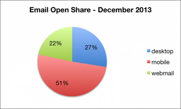
A report by Return Path on December 31, 2013 highlights the importance of mobile for email marketing. Over the 2013 holiday season, 51% of all emails were opened on a mobile device. Desktop had a mere 27% of email opens.
Mobile responsive web design is becoming more and more critical to businesses. For businesses that use email marketing as a central channel for their campaigns, mobile websites cannot be forgotten.
This fact may be increasingly true for ecommerce websites. Email plays an important role in eCommerce. From cart abandonment offers to account updates, email must be a fluid extension of any eCommerce website. According to a report by eDigitalResearch and IMRG, 77% of eCommerce shoppers abandoned their shopping carts in 2013. Yet, more than an eighth (13.3%) of shopping cart abandonment emails are clicked and nearly 50% are opened. About a third of these emails lead back to a sale on the website. Considering that 50% of emails in the Return Path study are opened on a mobile device (and 62% on Christmas), the coupling of mobile responsive web design with email marketing should be part and parcel.
Email is also the fourth largest content sharing platform--just below Facebook, Twitter and Pinterest, according to a 2014 study by Sharethis. This study by Sharethis may under count the performance of email in favor of social platforms as well.
When users click from email content on mobile devices and receive a desktop-only web experience, their user-experience is impeded. They go from reading a clear, concise message on their mobile phones to having to pinch, swipe, scroll and scan for next steps on a website. This can cause excessive drop-off.
For SEO, mobile optimized websites are becoming increasingly important. Google rates and judges websites based on load-time performance for mobile specifically. New features in Google Webmaster Tools help web developers and website owners track load-time issues for both desktop and mobile.
Additionally, Google is overhauling their Googlebot for mobile. A new Googlebot will be released shortly and seek out mobile responsive websites to improve content results for mobile searches.
As a best-practice, emails and websites should be optimized for desktop, tablet and mobile. Email marketing offers and communications should be paired with like-message landing pages that play well with the device accessing it. Optimization for mobile must factor in calls-to-action, design, messaging and user behavior to drive increased performance for campaigns. Although this may complicate marketing, it makes communications more relevant to prospects, subscribers, fans, leads and customers.

SOURCE:
Tel 212-993-7809
Ironpaper ®
10 East 33rd Street
6th Floor
New York, NY 10016
Map
First-party data marketing
SEO for B2B
Customer journey strategy
ABM Agency
Marketing for IoT Companies
HubSpot Implementation
B2B Product Marketing
Measurable Marketing
IoT go-to-market strategy
IT Marketing
HubSpot for ABM
Go to market strategy
Technology Marketing
Marketing for IT Companies
ABM Campaigns
B2B lead generation
B2B Marketing and Growth Agency.
Grow your B2B business boldly. Ironpaper is a B2B marketing agency. We build growth engines for marketing and sales success. We power demand generation campaigns, ABM programs, create B2B content, strengthen sales enablement, generate qualified leads, and improve B2B marketing efforts.