B2B Articles - November 10, 2015
Continuously generating quality leads for your sales team isn’t something that happens on its own. The "if we build it, they will come" approach (sadly) rarely works.

Lead generation takes consistent, careful consideration and optimization of your website, SEO, and content creation initiatives as a whole to ensure you’re doing everything within your power to bring the right prospects to your site and get them to become leads. When companies report that they’re having a difficult time with lead generation, more often than not it’s because there are problems with their website, SEO strategy, and/or content that are preventing them from reaching their goals. Inbound marketing is vital to help strengthen the sales pipeline.
With that said, are some of the most common website lead generation problems– and how to fix them:
Problem #1: Relying only on your homepage to generate leads. While your homepage can help you generate leads, it’s no longer the single most important page on your site. Users now arrive on your company’s website through various links they find via search engines, email, social media, advertising, related websites, and other channels. As these entrance pathways direct users to landing pages and blog articles, these pages need to be optimized to convert your various buyer personas as well – not just the homepage.
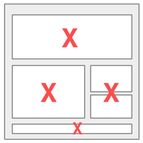
Problem #2: Using sliders on your homepage. Sliders are a popular and widely used design feature – but they don’t convert. Because visitors ignore them and/or find them annoying, they don’t click on them. As such, sliders have no business being on your website if you want to generate leads. Instead, we recommend adopting The Hero Layout, which is used by websites that are known for their high conversion rates, like Spotify, Square, and Dropbox. It involves using a single content section with one clear and easy-to-understand goal that comprises the entire first fold of your homepage. It takes up the entire screen, but feels simple and is one of the highest-converting layout formats currently being used by organizations of all sizes.
Problem #3: Not having a clear value proposition that resonates with your customers. When visitors arrive on your site, they need to immediately know that they are in the right place. As such, the site should directly relate to the needs, challenges, and desires of your buyer personas, so they understand that your company has the solution they need. Communicate this to them using descriptive copy, high-quality images, and a specific headline.
In addition, your value proposition needs to clearly communicate to prospects why you’re better than the competition. For example, are you the best, most credible, or simplest option? What do you have to offer that your competitors don’t? Provide your benefits, ROI, and customer testimonials to thoroughly explain what you bring to the table.
Problem #4: Not having educational content. High-quality, educational content is key to driving traffic to your website and incentivizing prospects to convert to leads. Rather than blogging about your latest news or press releases, give your potential buyers content they’ll find interesting. To get started, ask the sales team for questions and concerns that commonly come up during the sales process, and create blog posts designed to address those issues for each one of your buyer personas. From there, create premium educational content, like an e-book or a white paper on a related but more in-depth topic, and require visitors to become leads by entering their contact information to gain access.
Problem #5: A web design that isn’t optimized. If your website, landing pages, and forms aren’t designed so they are easy to navigate, user-friendly, and appealing to your buyer personas, they aren’t going to convert. In general, a streamlined, clean design will convert far better than a cluttered one. Make sure there’s a very visible CTA, use high-quality images, and clearly highlight the value of your content and company. Also, make sure your forms are short and simple to increase the likelihood that your prospects complete them and become leads.
Problem #6: A web design that isn’t mobile responsive. Mobile users have different needs than desktop users. Mobile websites need to load faster, contain less content, have a streamlined navigation, and contain appropriate calls-to-action. We recommend optimizing the layout, load time, the content, and the calls-to-action to ensure that mobile users are able to have a great experience and take appropriate action.
Problem #7: Not having accessible and visible forms and engagement points. Engagement points could be as simple as having a clearly visible call-to-action for an eBook or having a lead interest form. Placement of these points of engagement have a large impact on usage. Ideally, these points of engagement would be aligned with (#3) a strong solution or brand value proposition and (#4) purposeful education content.
Problem #8: Being boring. Even B2B websites need to be exciting and beautiful. Strong, compelling design build trust and make a brand feel more relevant. Don't be boring as a brand. Create a compelling message. Employ strong design. Reduce barriers to engagement, and define a brand that is interesting, enticing, unique, and helpful.
See also: 4 Common B2B Lead Generation Mistakes
Tel 212-993-7809
Ironpaper ®
10 East 33rd Street
6th Floor
New York, NY 10016
Map
First-party data marketing
SEO for B2B
Customer journey strategy
ABM Agency
Marketing for IoT Companies
HubSpot Implementation
B2B Product Marketing
Measurable Marketing
IoT go-to-market strategy
IT Marketing
HubSpot for ABM
Go to market strategy
Technology Marketing
Marketing for IT Companies
ABM Campaigns
B2B lead generation
B2B Marketing and Growth Agency.
Grow your B2B business boldly. Ironpaper is a B2B marketing agency. We build growth engines for marketing and sales success. We power demand generation campaigns, ABM programs, create B2B content, strengthen sales enablement, generate qualified leads, and improve B2B marketing efforts.