
B2B Articles - October 20, 2016
Whether the phenomenon is deemed the choice paradox or analysis paralysis, most people have experienced an inability to decide when confronted with too many options. Marketers aim to appeal to an audience, by educating and delighting. This doesn’t mean piling on the choices. The job of an inbound marketer and web design firm is to build a smart user journey that guides the process of discovery and drives action.

Consider instead how to increase lead generation with a focused Call-to-Action (CTA).
The CTA (call-to-action) drives the action the marketer wants a prospect, lead or customer to take within a website. This is the instruction the digital marketer presents in an email, on a landing page, or on a website to perhaps “call now,” or “learn more,” or “schedule a demo.”
More than 90% of visitors who read your headline also read your CTA copy. — Unbounce

Consider these two scenarios:
Which one appeals? We’ll bet it’s the clear and simple Option A. And notice we only gave two options there, so you didn’t have to work too hard to decide. Otherwise, you’d probably have stopped reading already.
Focusing on just one action helps drive the person presented with a CTA to actually click the link.
Personalized CTAs convert 42% more visitors into leads than untargeted CTAs. —HubSpot
Marketers can’t effectively increase lead generation without prospects clicking the CTA. So, how does one focus a CTA and generate more sales leads with just a concise few words in a brightly colored button?
In website design projects or communication campaigns, it’s important to develop strong CTAs and design clear calls-to-action. Plan for strong, compelling content with clear CTAs to power business success and growth.
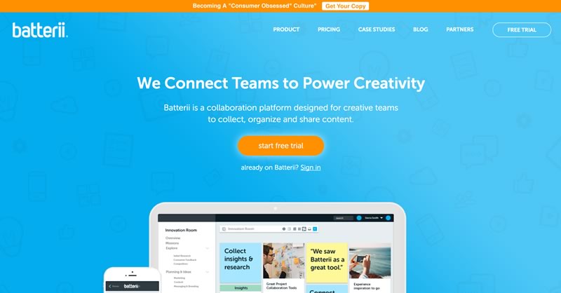
Reduce the number of distractions in the email, on the landing page or on the site. Hierarchy is important for lead generation. In creating compelling content with strong CTAs, focus on a single option to enable scanning and a quick decision.

Recognizing the target audiences’ limited amount of time and attention, center each landing page or email communication on a single call to action with streamlined messaging. When there is more than one goal for a campaign, create tailored communications with different CTAs for each one.
Word choice matters. Always. But in a CTA you have fewer words to work with, and a lot you want to accomplish. After all, the CTA should remove or reduce risk, encourage people to act immediately, instruct people what to do, manage expectations, inspire the audience, outline the benefits, tantalizes our curiosity, and…well, you get the idea. All that in just a phrase? Good thing there are writers in the world!

Top tips:
Emails with a single call to action (rather than several) can increase sales a whopping 1617% — Wordstream
There are many elements to consider in designing a CTA that works. Top tips:
ContentVerve saw a 90% increase in click-through rate by using first-person phrasing: "Start my free 30 day trial" vs. "Start your free 30 day trial.”

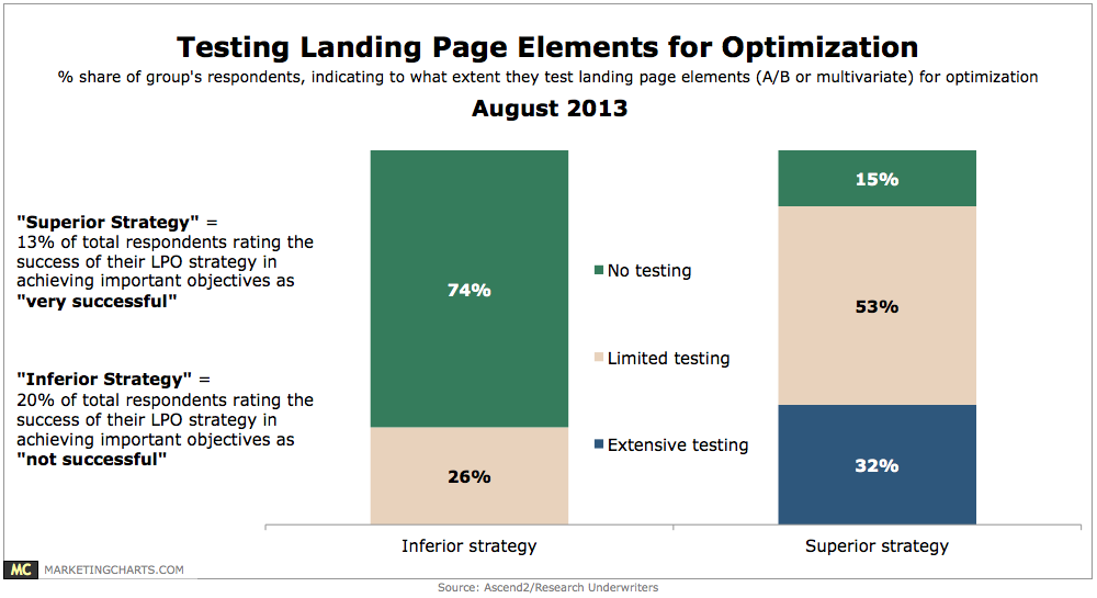
Knowing the audience is an important part of successful marketing. Understanding that audience and testing to see what CTAs resonate and net results is critical to increasing lead generation and scoring higher conversions.
Increase lead generation with a focused Call-to-Action (CTA) Sources:
Aragon, K. (2013, July 24). 21 Call to action Examples and 3 Rules for Effective CTAs. https://blog.crazyegg.com/2013/07/24/call-to-action-examples/
Gregory, M. (2016, October 6). How choice paradox is killing your email click rates. https://content.myemma.com/h/i/293095074-how-choice-paradox-is-killing-your-email-click-rates
Leaning, B. (2016, March 9). 31 Call-to-Action Examples You Can’t Help But Click. https://blog.hubspot.com/marketing/great-call-to-action-examples#sm.00012g66czam8e61x1p1jlvdtvz6t
Smith, J. (n.d.). Everything You Need to Know About the Psychology of the Call to Action. https://blog.kissmetrics.com/psychology-of-the-cta/
Wilson-Rew, A. (2016, March 10). 16+ Kick-Ass Call-to-Action Statistics That Prove CTAs Are Essential. https://www.protocol80.com/blog/16-kick-ass-call-to-action-statistics-that-prove-ctas-are-essential
Tel 212-993-7809
Ironpaper ®
10 East 33rd Street
6th Floor
New York, NY 10016
Map
First-party data marketing
SEO for B2B
Customer journey strategy
ABM Agency
Marketing for IoT Companies
HubSpot Implementation
B2B Product Marketing
Measurable Marketing
IoT go-to-market strategy
IT Marketing
HubSpot for ABM
Go to market strategy
Technology Marketing
Marketing for IT Companies
ABM Campaigns
B2B lead generation
B2B Marketing and Growth Agency.
Grow your B2B business boldly. Ironpaper is a B2B marketing agency. We build growth engines for marketing and sales success. We power demand generation campaigns, ABM programs, create B2B content, strengthen sales enablement, generate qualified leads, and improve B2B marketing efforts.