
B2B Articles - April 26, 2016
With 93% of buying cycles beginning with an online search, a business website needs to efficiently communicate value proposition, aesthetically appeal to users, and offer optimal user experience — across devices. After all, 40% of smartphone and tablet owners search for B2B products on those devices. The following 10 trends in web design today can help the B2B marketer focus their website efforts.
75 percent of users admit to making judgments about a company’s credibility based on their website’s design. – Stanford University
#1 Clear Calls-to-Action that are Sticky, Personalized, or Device Specific.
A single, button-shaped call to action that is always visible as the user navigates your page is a good practice for lead generation or increasing engagement. Positioning it in a header or footer without other distractions can help increase conversions.
#2 Background Video or Animated Interactivity.
Animated or video backgrounds can add dimension to the page and enhance visibility and credibility — that is if the technique is used in moderation. Although this design trend is fairly commonplace (borderline overused), it can still be used elegantly. Animation or CSS transitions can make a website more memorable and interesting, but overusing this can be a risk.
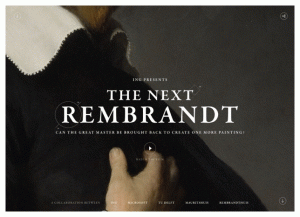
Image source: awwwards.com
#3 Responsive Design.
Responsive website design is a standard in website design today for good reason. Mobile responsive design (or development) is growing increasingly important as users move to viewing web content across multiple platforms.
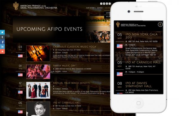
#4 Streamlined Navigation.
Your user is more likely to convert if they can find what they need. Simplicity and clarity is key. Today’s navigation is often streamlined with only priority options available on the main menu--removing redundant items that waste precious space, such as "Home." Secondary navigation is accessed via an additional tier, if required. With many successful modern websites, navigation tends to focus on improved accessibility, legibility, and ease of use--over flashy design quirks.
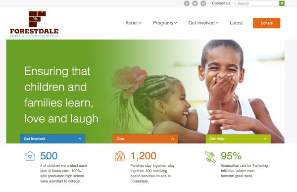
#5 Large, Cinematic Images.
Instead of using several smaller images on a page, a single, larger image can drive a more cinematic experience for websites. Reducing the number of images on the page also assists site speed, while helping to focus your message.

Once your website loads, users form an opinion in .05 seconds
#6 Attractive Minimalism.
With users wanting to find what they need and quickly, design is shifting away from complicated (busy) websites to a stripped down, more minimalistic approach. An extension of this idea is being seen in site typography where designers are limiting the number of typefaces employed.
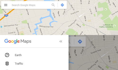
#7 Elegant and sometimes beautifully understated.
Many websites are able to make use of the increasing sensitivity of high definition screens by shifting design towards beautifully understated canvases. More than just minimalism, this trend focuses on subtlety that may not necessarily be minimal.
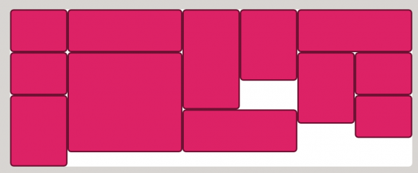
#8 Modular, Mosaic, Masonry or Mondrian-style Layouts.
Grid systems and modern style sheets have enabled a new way of thinking about the web design canvas. Frameworks, like Masonry, allow for content panels and grid cells to be interlaced into beautiful mosaic systems. These layouts and systems allow for new possibilities for organizing information.

#9 Dynamic Personalization.
Since successful inbound or data-driven marketing segments audiences and provides content specific to users' needs and lifecycle; new websites support that marketing trend with dynamic content, CTAs, layouts, or messaging that identify past users or browsing patterns to share more relevant content. For instance, you might take potential users to one landing page, while potential franchise partners would go to another. In this way, you are giving your users a tailored, personalized experience on the site from the outset. These personalization configurations can be helpful with organizing lots of information into usable systems that help users accomplish goals.

#9.5 Magician content.
Well, this one is a bonus item in our list (#9.5).
Using CSS or Javascript, website designers can hide or show information based on user interactions or needs. We call this magician content. Simply stated, you can elegantly reveal content--when needed--for the right user--based on their needs.
Users read just about a 1/4 of the information on a web page
#10 Design Optimized for Speed.
Delays deter visitors. With only five seconds to engage a visitor to your site, a mere second delay can mean loss in conversions (7%), fewer page views (11%) and decreased customer satisfaction (16%). In fact, 1 in 4 people will abandon a website if it takes longer than four seconds to load — and that’s from a 2014 study. Imagine how much sooner they jump ship today.
Design is always evolving. Yet, keep in mind that new web design must also prove functional for your users and your business. Simply embracing a new web design because it is currently cool and popular is a quick way to lose touch with your audience.
Trends in Web Design Today Sources:
Tel 212-993-7809
Ironpaper ®
10 East 33rd Street
6th Floor
New York, NY 10016
Map
First-party data marketing
SEO for B2B
Customer journey strategy
ABM Agency
Marketing for IoT Companies
HubSpot Implementation
B2B Product Marketing
Measurable Marketing
IoT go-to-market strategy
IT Marketing
HubSpot for ABM
Go to market strategy
Technology Marketing
Marketing for IT Companies
ABM Campaigns
B2B lead generation
B2B Marketing and Growth Agency.
Grow your B2B business boldly. Ironpaper is a B2B marketing agency. We build growth engines for marketing and sales success. We power demand generation campaigns, ABM programs, create B2B content, strengthen sales enablement, generate qualified leads, and improve B2B marketing efforts.